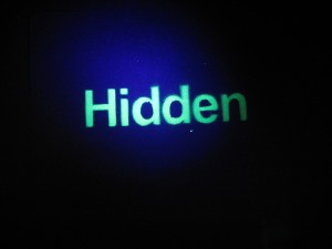
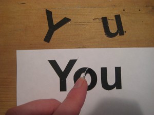
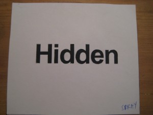
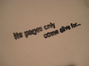
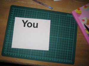
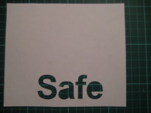
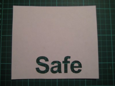
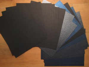
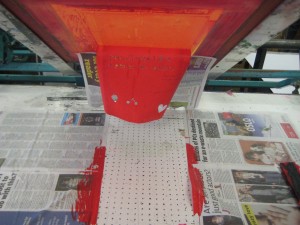
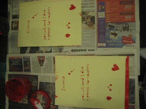
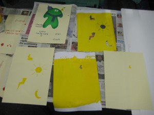
Spray painting with glow in the dark paint- activates when shining a UV light onto it
Posts Tagged ‘stencil’
Spray painting
May 31, 2010Creating the pages for my book
May 31, 2010Making, Creating and Experimenting
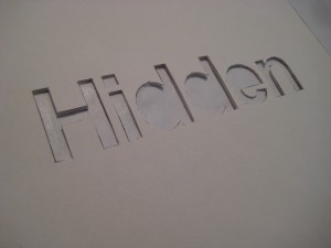
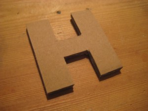
May 31, 2010Stencil for embossing
May 23, 2010Ambient advertising and Ian Brown
May 5, 2010Two parts that I really liked from Isabella Fernandes’ research on her blog:
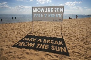
The first image is of Ambient advertising. I like how it used the environment and its surroundings to create the advertisement.
The second image is a poster by Ian Brown. All of these posters, with clever little parts to them, can be so simple, yet so effective. Really it is a simple idea, yet it is what makes the poster, it brings it to life.
Su Blackwell
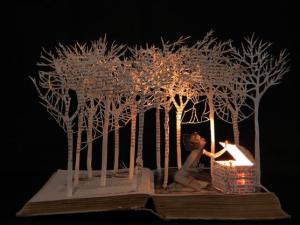
April 29, 2010Su Blackwell was another name mentioned in Monday the 19th’s presentation by another group. When I then started to conduct some research into Su Blackwell’s work, I realised that I had actually posted up some of the work she has created already, without knowing who it was by. Anyways, here is some more beautiful, intricate work and another example of exploring the format of the book in a unique and interesting way.
I like the inclusion of the light above, it really adds something to the design and emphasis’ the real craft and intricate paper sculpting.
Stefan Sagmeister
April 19, 2010Just the other day I rented from the Universities library two of Stefan Sagmeisters books; Things I Have Learned and Sagemeister- Made You Look. Not only do both of the books involve very interesting information, stories and recounts of different projects but the formats for both of the books are extroadinarily unique and very interesting.
This book is Sagmeister- Made You Look
You can see that as the book is removed from the casing, the image of the dog transforms. The tinted red box doubles as a red filter, so we only see the full effects of the whole image as it is brought out from under the red casing. Also you can only see the writing on the side of the book at a certain angle. I like how the writing on the side also overlaps onto all of the pages in the book.
The second book, Things I Have Learned, again involed a unique format. The book casing has a unique cutting to it around the image of the face but even more unique is that inside the book casing there is not just one book, but a number of smaller books. Adding to the design aesthetic is how the book cover/casing can constantly change by altering the order of the different smaller books. Placing each of the different mini books behind the stencil on the book cover, each time, allows the cover to gain a different look and style to it, filling the stencilled face with different colours and patterns.
Some of Stefan Sagmeisters work that really appealed to me in connection to the research for my Final Major Project:
This first project was a collaboration with Ralph Ammer. To begin with I was very intrigued by just the still images of the spider web, before then reading about the project finding out the full extent of it. The digitally woven web sees the viewer as they pass it, resulting in the viewer ripping the web wherever his or her reflection touches it. Everytime, exactly how a spider would, the web reconstructs itself.
http://www.youtube.com/watch?v=U–PIzSuOv8
I love the hand made elements, the play with materials and the evolving changes to many of the designs that Stefan Sagmeister creates. This is an example of one of them:
For a full week, stencils and plants were laid out on newsprint and were exposed to the sun, in the end the areas underneath these objects turned white, while the surrounding area turned yellow. After this the newsprint was shipped to Lisbon where it was then put up onto a billboard in a sunny spot. Within a week the typography had slowly faded away.
This is what I love; the change to the design and how the artwork evolves. Viewers will take away different things from the design depending on what stage they see it, or if they have been lucky enough to have witnessed the slow fading throughout the week.
This is Stefan Sagmeister’s business card:
As you pull the card from the casing it reveals the simple trickery of the writing having been covered up. The deception is simple through the eye becoming distracted from the movement.
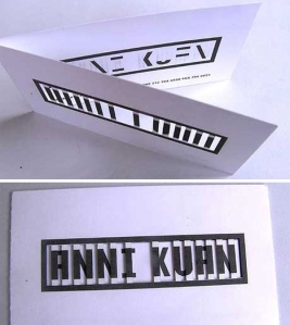
Another nice business card, this time Sagmeister designed it for Anni Kuan. Again it is just a simple technique, yet it makes the card so interesting and unique. The name is revealed until the card is closed and only when it is closed. These elements may be what keep potential clients from throwing the cards away, as they probably stand out from alot of others.
A very different poster:
Hand-made, body carved poster! What more could you really do to intrigue viewers and to create something unique. It involved 8 hours of cutting! A studio intern ended up doing the cutting into sagmeisters body, I bet he wouldn’t forget that design experience for a while!
Packaging work for Mountains of Madness:
CD packaging with the same technique as the cover for the Made You Look book. Stefan Sagmeister:
“The little plastic jewelcase not only had potential for exploring surprises, it offered the interplay of moving surfaces and materials.”
I picked this quote out as this is also what I enjoy and like; the play and exploration of materials and interplay.
NZ Book Council
April 15, 2010I saw this video a while ago through Creative Review and as I am looking into books and pushing the boundaries of books I have added it to my research. It is so beautiful and intricately created, you can imagine how much time it took to create the video.
ABC3D book
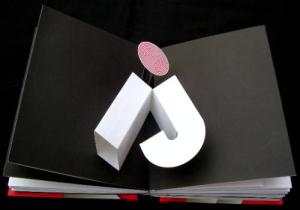
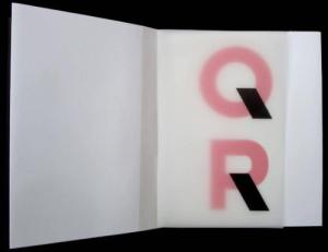
April 7, 2010While researching books I came across this video of a ABC3D book on the Inspiration Lab. It really stuck out to me and found it very inspirational. It has a look of simplicity yet mixed with complicated pop-ups and cut outs. It doesn’t need lots of text as you just appreciate the design of the letters. I think it is very playful, visually interesting and very well finished. Unique and inspiring.
The book is by Marion Bataille
Inspiration Lab link:
While looking at the ABC3D book on Amazon I also saw this one ‘Trail:Paper Poetry’ by David Pelham. This also looks like a very beautiful book with very intricate and complicated cuttings.
http://www.amazon.co.uk/Trail-Paper-Poetry-David-Pelham/dp/1416948945/ref=pd_bxgy_b_img_b


