Archive for January, 2010

Home Start Charity

January 28, 2010

For our new project, we all had to pick one out of a number of different briefs and sign-up to our chosen one, this was back around Christmas. I chose to sign-up for the brief on creating new material, to help raise awareness, for the charity Home Start, particularly working with the Camden section as it has recently lost its council funding and has had to let its paid central manager go. Home Start is a national charity though and is a completely unique charity providing help to distressed families with children from 0-5 in their own homes.

To start with we were talking about Home Start and asking alot of questions about the charity. Some questions aren’t really answered on their current websites etc. Then we had to start thinking about which section of the campaign we wanted to work on out of; the awareness campaign, promotional material or the website. To sum it up it was more out of: creating an animation for the website and to send out, leaflets and a gift aid form or the company report brochure; creating a template for it.

To start with I was thinking about working with the awareness campaign but then decided on the promotional material as it is probably the print side of design that I want to go into more in the future, so this was more relevant. Also I haven’t created a leaflet before so it would be great experience, good inclusion in my portfolio and also I hope that it will help improve my layout skills.

So the research begins…..

Volunteer work: Image of the month

January 28, 2010

I won photograph of the month for my volunteering with thesite.org. yayyyy!

This was my photo:

I contributed a number of snowy pics and this one was used on thesite.org.

Image of the month:

http://www.thesite.org/about_us/volunteers/photographers

And I won a t-shirt 🙂

Lego + Chance + Fibonacci

January 28, 2010

I attended a Grids, Units and Modules workshop at University. Darren showed us a presentation on the goldren rectangle and talked about using this, the rule of thirds and the Fibonacci sequence in creating layouts and typography hierarchy etc.

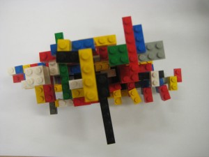
After the presentation we split into 3 groups and each group were given a rule or sequence, a word and definition and objects in which we would create something with using the rule and word we were given. Our group were given the word chance, the fibonacci sequence and lego! lego yayyyyy. In the end we decided to use the fibonacci sequence to create shapes with the lego and it would be by chance how they turned out, if they looked the same, completely different shapes, similar colours and so on….

So we each started with any random 5 bricks and made any shape.

Then we passed this to the person to our left and they then added 8 new bricks to it, in any way that they wanted…

Next we passed it round again to the person on our left and then all of us added 13 new bricks to the new model we had been passed, in any way we wanted to.

This went on from starting with 5 bricks, from working through the fibonacci sequence, to each adding 89 bricks! We couldn’t possibly carry on with the sequence any further as there were not enough bricks.

You can see each of the models that I was being passed building up as we added more and more lego to them.

By passing the model each time we had added the next number of bricks in the sequence, to the next person, kept it random, instead of us just each working on our own model.

The models all actually ended up looking quite similar, they were all pretty much a similar height and width. Obviously they had differences about them but really they were quite similar.

As Darren said, with lego you are inclined to build up, instead of out because of the design of the lego, so this is why our models went upwards, rather than outwards.

The next group were given the rule of thirds, the word balance and post it notes. They created this scale shaped in the rule of thirds and also being balanced.

The last group had the golden rectangle and clipart so they created the clipart in the shape of the golden rectangle, showing the growth of the phone, with the most modern phone being the largest in size. It is showing the growth of technology.

Summary of the A-Z project

January 27, 2010

After writing about it, posting pictures and various updates for a while now, our A-Z Graphic Language Project is now over! I still can’t believe that its over, I think I have become so used to working on various aspects of it and constantly having it in the back of your mind that you have to do this for it or do that for it. We handed in the final PDF yesterday. I think many students had very little sleep, if any at all.

Previously I new that I was interested in hand-made designing but this project has really enabled me to discover that this is the type of design I enjoy the most and if lucky enough would love to be able to do in a future job maybe.

Regularily looking at different design websites, magazines, books and random blogs is such a great way to develop a project and to keep your mind flowing with ideas. It helped me progress my project by giving me new ideas of design techniques that I could incorporate into the project.

The project has also helped me improve my blog, as I have been creating much more regular posts and sharing much more of the whole process. Also one of my posts showing different design techniques made it onto the homepage of WordPress, so this was a wonderful achievement and something that gave me more confidence in my blog.

I new that layouts were something that I definitely needed too improve on and from my first draft of my A-Z I think there definitely was some improvement but I know that I have a long way to go. Practising layouts and looking at different sources for inspiration is something that U will continue to do, so hopefully I can imrpove on them much more.

I enjoyed the fact that we could bring alot of our own work into the project and show work thats reflects us. Some pieces I know now that I would have liked to have done differently but this will now provide me with a solid basis to work on and use as ideas and inspiration for future work. I also wish that I had included even more of the research and work that I created along the way into the PDF.

However I feel that this project has been a great learning curve and something that I will really take with me into the future as being a great experience. I know for next time what ideas I may want to develop on and what I would improve for next time.

Creating and developing A-Z pieces

January 24, 2010


More Inspiration for layouts

January 20, 2010

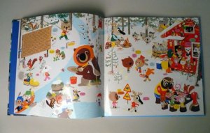
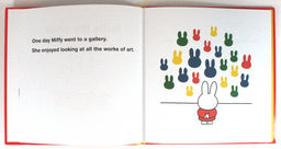
I am just trying to find more layouts that can inspire me. I really do want to improve my layout ability, by creating more energy and interest. I am just worried because I have so many pages to work on… 100 pages to be exact and I want to try to give each one an interesting layout. I have been looking alot at childrens book layouts, taking on advice from Philipa to look at childrens books like the ones in the Tate as they have some fun, beautiful layouts. Looking at the layouts of childrens books will provide me with some fun, playful layouts, which will work well with the fairy tale theme of my A-Z project.  A few of the pictures below are from books on the Tates website.


New Inspiration

January 20, 2010

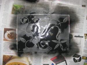
I saw this work probably just over a month back and absolutely fell in love with it. The work is by Rob Ryan and it appeals to me so much because the stencils are created by hand. They are so detailed and well crafted and then the final presentation is what finishes it off.  He uses the same type of white paper in each of his pieces (it’s a thin, smooth, large-format Bible stock) and colours each one using spray paint. For my A-Z project I have already created a stencil of a wolf in the forest, where I then spray painted the white paper black, this was before I even saw this work.  There are already pictures of this spray paint work up on a previous post for the A-Z project. I am going to try, hopefully if I have enough time, to create my own delicate stencil but that may be easier typing it than doing it in real life.

 rob-ryan.blogspot.com

Brighten the Corners has published a set of three posters, created from 10 years worth of incoming messages to the studio. The posters don’t just show off the positive messages but the angry and the dull ones as well. I have written about this work as a contemporary example in my VCT essay of using the vernacular.

To coincide with this idea I am going to create another piece for my A-Z using found type from a real life fairy tale story. Instead of it looking like these posters, I am thinking of using illustrated type and then either to create an illustration to go alongside this or to create the type to end up looking like the shape of a castle when it is all laid together.

http://www.brightenthecorners.com/

Below are beautiful illustrations by Maija Louekari. She uses varied media to create her artwork. I found the ones below from the website:

http://inspirationlab.wordpress.com/

and these ones from her website:

http://www.maijalouekari.com

From the Inspiration lab:

The deadline for this A-Z PDF project is close upon us!

Let it snow, let it snow… AGAIN!?

January 7, 2010

Everyone has to have a few pics of the old snow!